Introducing Box Plots
PLATFORM
We are excited to announce the addition of a new feature within YAGRO Analytics - an addition developed to provide farmers with even more clarity on their crop, variety and field performance when comparing performance against market ranges; all helping to make more informed decisions.
At YAGRO we understand the value that data holds when used in the right manner. Therefore that data needs to be presented back in the most informative way possible. By adding Box Plots we are able to provide a higher level of clarity compared to our original linear market performance bars. Now simply click on any linear market range within the platform to bring up the more detailed box plot view.
Emma Kelcher, Senior Customer Success Manager at YAGRO said “This will enable customers to add more confidence to their decision-making . It indicates to customers where they sit within quartile ranges in both procurement and crop performance level. Giving clarity to farmers on where they sit within the distribution of data ranges and allowing them to highlight areas of their business they should focus on for better efficiency and risk mitigation.”

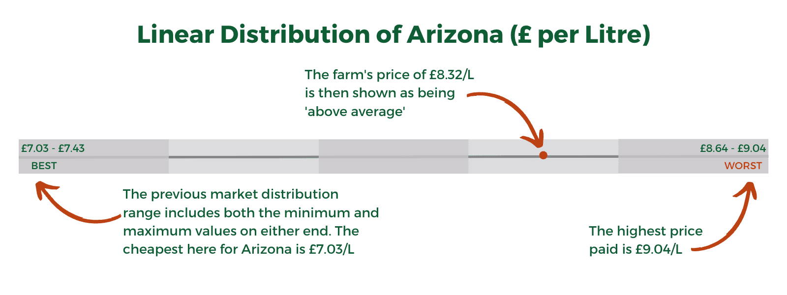
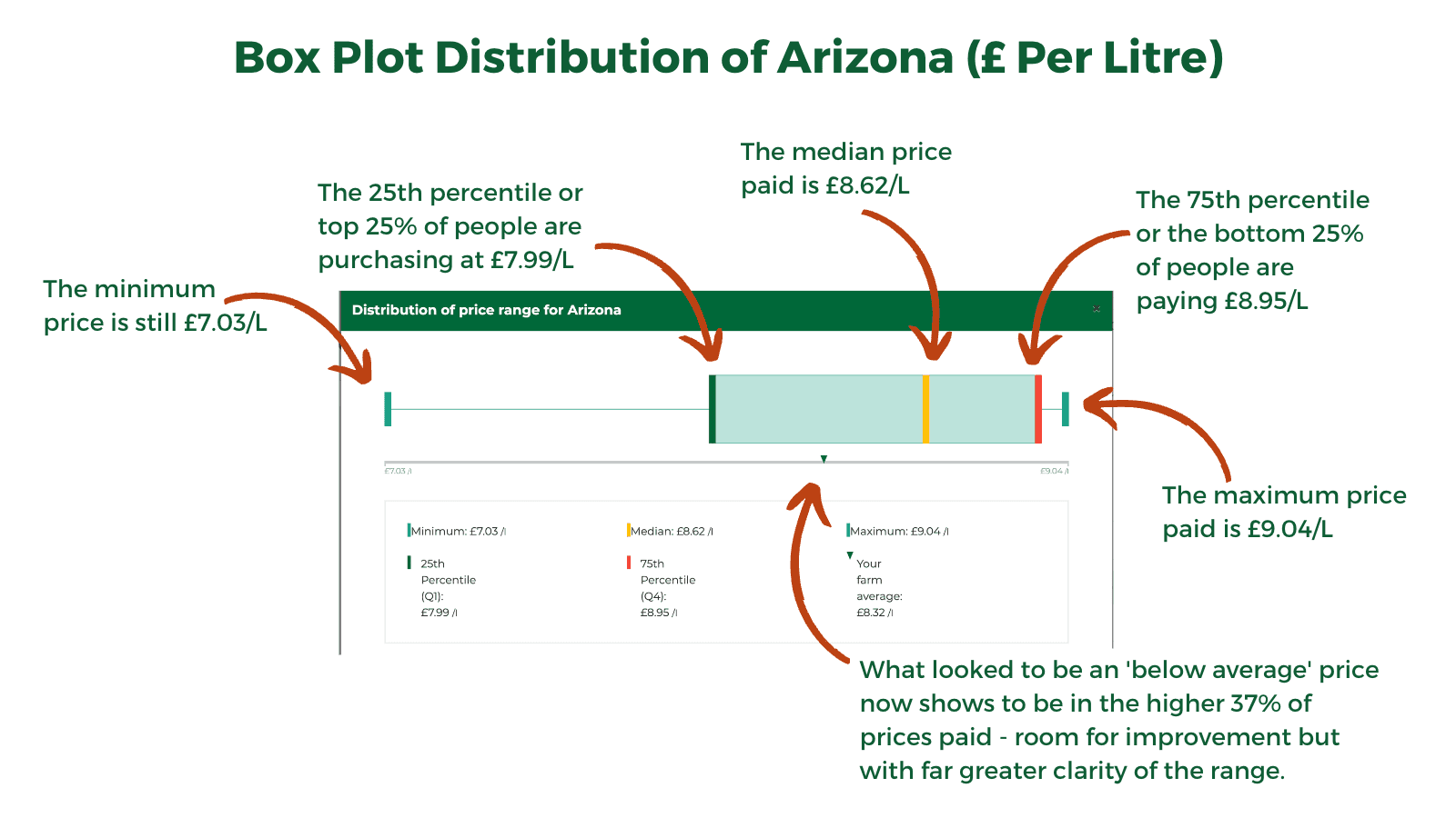
Using Arizona (500g/l of Flopet) as an example. In the original market range distribution, it showcases the minimum and maximum value and marks the farms spend in relation to those values. This image suggests a £1.29 or 15% overspend. But lets look at that same example with a box plot instead.

The new Box Plot feature contains the same values but with a whole new level of context, the below-average price of Arizona is now in the top 37% of prices paid, not the best but clearly above average.
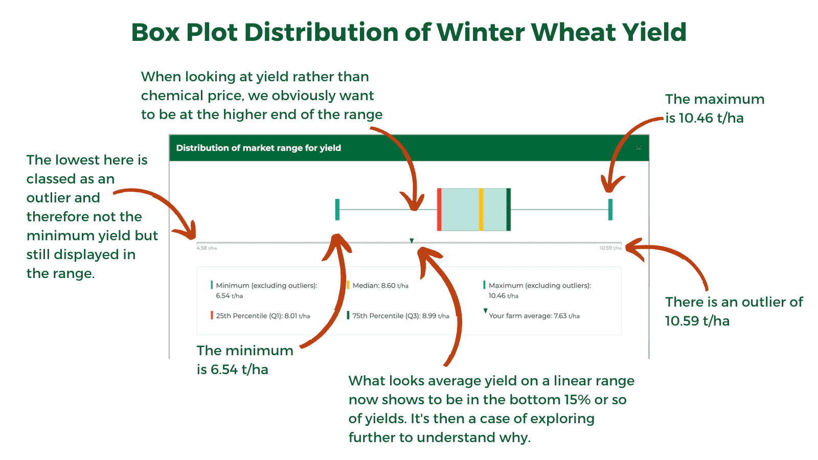
An additional element to box plots is that we can now clearly flag outliers. Outliers are prices or results that have been achieved and verified but are distant from the core data set. We are showing outliers on the original linear range and the box plot is then overlaid above this as per the yield example below.

It is a feature that has been requested by several of our customers “It’s a great tool to have, it lets you visualize the distribution of results and helps you omit the outliers in the market,” says Sam Pimblett of Wilson Wraight “The Box Plots feature will help a farm be realistic on their performance and will allow the business to be realistic with their targets - a 200 acre farm will have a different buying power to a 5000 acre farm.”
One of YAGRO's own, Chris Lloyd, who heads up our frontend engineering team and helped develop the feature said "It's been in the pipeline for a while due to the huge demand for it. The tricky part was lining up the box plot with the original market range distribution, but it was worthwhile getting it done because it's a fantastic visual aid for the farmer - it really highlights the difference and where they stand in terms of costs."
Box Plots reveal even greater insight when analysing the performance of a farming business. It allows farmers to review their own performance versus the market and understand if there is a worthwhile and attainable level of improvement to go after. The feature has been added into YAGRO Analytics and is available through the Explorer and Price tabs. Any product that have the market range distribution provided, be it crop, variety or chemical - will now have the option to toggle the box plot view.