Speak to our team
The Challenge
Collecting data is only valuable if people can understand it.
Many programme teams still rely on spreadsheets, static reports and manually created charts that are time-consuming to produce and quickly become outdated.
Without live visualisations it is difficult to monitor participation, identify trends, communicate progress or understand where action is needed.
How YAGRO Solves It
Validated data
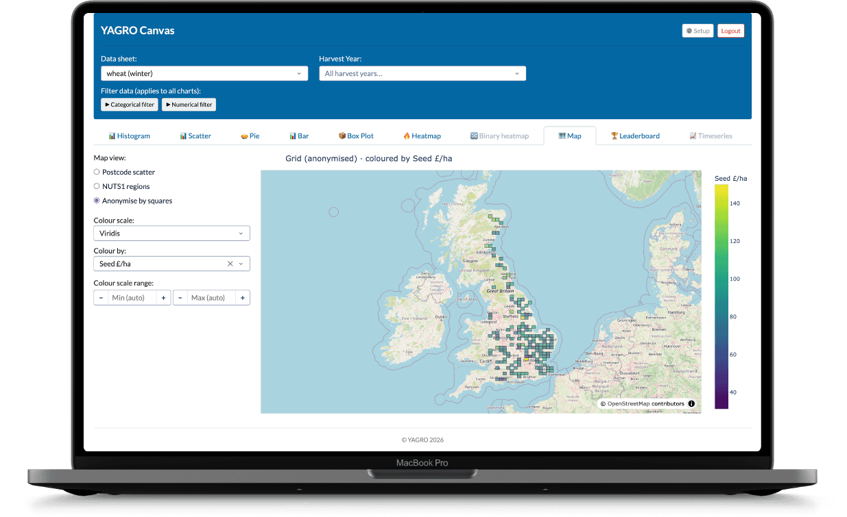
Canvas transforms validated programme data into interactive dashboards that make complex information easy to understand.
Canvas
Users can explore participation, sustainability outcomes, programme progress and operational metrics through maps, charts, tables and other visualisations.
Interactive charts
Dashboards update as new validated data becomes available, providing teams with a current view without manually rebuilding reports.
Maps
Explore regional trends, participation patterns and operational performance across programme locations.
Dashboards
Filter by region, crop, organisation, programme or any other relevant dimension.
Insights and reporting
Different audiences can explore the same trusted dataset from different perspectives.
Self-service analytics
Canvas helps users answer new questions themselves without relying on manually produced reports.
Key Capabilities
Interactive dashboards
Maps
Charts
Time-series analysis
Filtering
Drill-down analysis
Custom dashboards
Self-service reporting
Live programme monitoring
Secure permissions
Exportable reports
Responsive visualisations
Typical Workflow
1
Collect validated programme data
2
Automatically update dashboards
3
Explore trends through filters
4
Monitor participation and outcomes
5
Share insights with stakeholders
6
Support better programme decisions
Business Outcomes
Reduce manual reporting
Monitor programmes in real time
Identify trends earlier
Improve stakeholder communication
Support faster decision making
Who Uses This
Programme managers
Sustainability teams
Researchers
Food manufacturers
Supply chain teams
Senior leadership
Products Used
Example implementation
Rather than producing regular spreadsheet reports, validated programme data was automatically visualised through interactive dashboards. Programme managers could monitor completion rates, explore regional trends, review sustainability metrics and identify where additional engagement was required. Different stakeholders viewed the same trusted dataset through dashboards tailored to their individual requirements, reducing reporting effort while improving visibility across the programme.
Validated programme data
Interactive dashboards and maps
Insights and reporting
Frequently Asked Questions
What types of charts are available?
Can dashboards update automatically?
Can users filter dashboards?
Can different users have different dashboards?
Can dashboards be exported?
Can Canvas work with data collected outside Exchange?
Speak to Sales